Excuse the crude circumstances by which this was photographed, it is exceedingly difficult to photograph spray-paintings because of the strange way it glares and reflects lights and even shadows mess with the overall viewing of it. I think that ultimately, the only optimal viewing lighting is that of dull light, such as in the shade or at the ends of the day when the sun is going up/down. This one is getting submitted to the art exhibit, that's for sure. (10-18-08)
Wednesday, October 29, 2008
Fall Break Yields Piece.
Excuse the crude circumstances by which this was photographed, it is exceedingly difficult to photograph spray-paintings because of the strange way it glares and reflects lights and even shadows mess with the overall viewing of it. I think that ultimately, the only optimal viewing lighting is that of dull light, such as in the shade or at the ends of the day when the sun is going up/down. This one is getting submitted to the art exhibit, that's for sure. (10-18-08)
Buttons!
 My newest button invention, done last night (10-29-08). These are representatives of the 3 types of text on the button.
Friday, October 24, 2008
Last Batch
 12) This was my attempt at the whole "fire and ice" theme, so I tried doing an icy landscape with a frozen river or something with a strange looking moon/planet. Not my favorite
 13) Look familiar? I thought it did too, when I was painting it, I had painted all these cards (can't remember if I did 12, though) outside my classroom at Alta, because I was running out of time and I decided I wouldn't waste a whole period just because I was doing spray paints, so I snuck them into school. There happened to be a sub that day, not that that would have allowed or prevented me from my plans, but I asked her if I could and I showed her the cards I had already finished, which impressed her to find that I had done them in spray paint (which is pretty darn sweet, I'll admit) and she let me leave the classroom and go outside to paint in the slightly rainy conditions, forcing me to paint underneath the classroom window because directly above was a slight overhanging roof that made a dry spot just big enough to place my styrofoam spray board with my cards to be painted. Anyway, when I came in and looked at the other cards I had done, I realized that I had done practically the exact same stinkin' card as this one, only the other one had a smaller moon/planet. I quickly traded one of them with the girl that wasn't there on trading day so no one else would see that I had made two very similar cards.
 14) Cool color scheme, I guess, and nice triangular approach to composition. Triangle=dynamic.
 15) I think either Eston or Bradley ended up with this one, if you knew either of them, you'd know that it certainly plays to their tastes.
 16) I gave this one to Greta, my Italian exchange student as well as some others because I ended up with extras after trading day--the procrastinators didn't get them all finished, so I didn't get to trade with everyone I wanted to.
 17) My last one. Good thing, too, because I was runnin' out of ideas.
Thursday, October 23, 2008
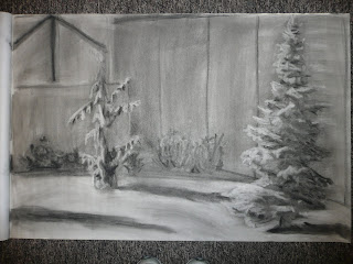
10-Piece Assignment, And Here's 11 Images
Drawing I assignment: do ten 30-minute charcoal light-drawings.
 1) outside me dorm on the side without the doors. Gave me the idea to grab a camping chair when I went home for the fall break. Done 10-15-08
 2) Here we have the door-side of me dorm. I discovered that I love drawing trees with charcoal, as you'll see in my later pieces. Done 10-16-08
 This is the imposter; it is not part of the assignment, but I wanted to be OCD in tendency by posting my work in order. I did this as a warm-up before tackling my two-day still life, which I finished today and it looks amazing (stay tuned to see it). 10-21-08
 3) This is in the "rec room" of me dorm. I like to play pool, so this is my tribute, even though the table seems to bend. I did place the pockets in dynamically compositioned places, though. (10-21-08)
 4) I hung out in the rec room and looked through the closets and found a cone and a volleyball. What else do you want? (10-21-08)
 5) Still in the rec room. Decided to draw the stinkin' closet. (10-21-08)
 6) We have a pumpkin in a basket on the table in the living room. Those are my toes at the bottom.
 7) Panic set in on 10-22-08 when this was done, as my assignment was due the next day (today. Just kidding, though, I wasn't panicked. I'm always cool and collected.)
  8) Also done on my dad's birthday. They're rocks.
 9) The library, place of inspiration inside and out. 10-22-08
 10) Decided that I could do this at 7ish, even though I didn't exactly take into account the fact that the sun goes down at night. Primped it up in the light of the FAC, but put in a good 15 minutes outside actually drawing the Toaster--that's what Loganians call this chapel. Maybe they're Loganites.
Wednesday, October 15, 2008
College Charcoals

(10-14-08)
My latest charcoal drawing (#3). I like this one because it is much more developed than my other two, plus I think I did a better overall job with placement, composition and accuracy. (10-9-08)
(10-7-08)
Me first charcoal drawing of college. Our class went out to the cemetery behind my dorm to draw. I think it turned out nicely--we weren't supposed to finish any of these, they're just for teaching us how to use the charcoal and technique that my professor wants us to use.
Friday, October 10, 2008
Graphic Alien
 I only used four colors for this "portrait" and I like the line quality of everything. I think it's pretty good for just a random 45-min art thing. I just got bored of wasting my time so I thought, alien, and started drawing. Put a cool experiment with "scumbling" in the background--and it doesn't just happen to be the complimentary color of my subject. Don't let the nature of his alien-ness lead you to judge, he really is a kindly, thoughtful ole guy.
Wednesday, October 8, 2008
Art Exhibition Announcement Committee Poster Idea

I joined the Announcement Committee for the Undergrad Art Exhibition so that I can (possibly) get some of my art in. We met last night and I hadn't come up with any real ideas because, let's face it, it's hard to design art for art, but this girl came up with an idea about using Picasso-esque bulls (fitting since we're Aggies) and so we agreed, so she went to work fixing up her layout. We had the option of getting together another type of poster to make more varieties of images, so I decided to do this parody of a USU logo, put into Picasso style. You like?
Thursday, October 2, 2008
Button Splashes


My new buttons for the new logos. The red/black is obviously for the DOA (9-24-08), the blue/grey is for the Business500 ( 9-25-08 ). I think they're lookin' pretty sweet. I'm amazing.
Wednesday, October 1, 2008
Sadness Is An Awesome Thing (In Art)
 I really like the face on the bottom. It was a Sunday and I didn't have much to do, so I tried figuring out facial proportions after the disaster on the far left. I took a picture of myself, then drew the face to the top-right (and turned it into a boy face) and then decided I wanted to get some better emotion/expression from this, so I finally got somethin' right.
Subscribe to:
Posts (Atom)