Wednesday, May 18, 2011
Saturday, January 15, 2011
Real Drawings
 Most of my drawings are really amazing, because they get better when I walk away and then come back later. Except the drawing of Jordann...I was drawing her live, and without telling her, so she soon moved and I had to just draw what I remembered. Now she looks like she's older and something else is just weird.
This is SUPER cool! I made a sphere out of dirt! It's called Dorodango, a Japanese art of polishing dirt, essentially. This was a trial run to see if I could pull it off. Now that I know how to do it, I'll use better sands/dirts so it can actually be polished. Did it over the summer.
Friday, December 17, 2010
New Logo


 "The strength of this logo is in its ability to communicate the core quilities of your company, namely, reliability, trustworthy, safety, and security. The symbol reflects safety/security and trust, because it alludes to the shape of a shield. Blue is also a very safe and reliable color. The symbol is given trust and stability as it is balanced as well as self-contained--without distracting lines or forms that lead outside the shape. The typeface has been modified slightly from its original version to ensure a high-quality font and to make it unique in the marketplace. The entire mark is progressive and modern, communicating how your company is up-to-date and innovative. A good logo will function well in black and white."
Hopefully this logo will result in another $200!
Monday, October 18, 2010
Brand ID Design
Brand Identity Design is the best class ever. I have sky-rocketed in my skill with Graphic Design. I'll almost make the claim that I'm good. Really good. Here's a quick summary of the projects I've had throughout the semester.
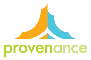 This one's due this Wednesday; for a venture capital company, I'll sell it to ya later.
The otter. Our first assignment was to abstract an animal. My teacher complimented me very highly by saying it's almost a portfolio piece.
 This one's due this Wednesday; for a venture capital company, I'll sell it to ya later.
The otter. Our first assignment was to abstract an animal. My teacher complimented me very highly by saying it's almost a portfolio piece.
Labels:
college,
Graphic Design,
Illustrator,
Logo Design
Tuesday, August 3, 2010
Logos (200th Post)
 Started submitting to logo contests again, hope I can make a few bucks off 'em. These are probably the best logos I've submitted in my entire career.
This one's my favorite. I'll come back later and copy the awesome descriptions I made about the two--they're full of intrigue and excitement. Actually I think I might be able to sweet talk my logos into better positions, because if I comment on each of my designs, it'll make me sound more professional and the client will see the logo the way I want them to. Plus hardly any of those guys on the contest site put the effort to do such a thing, so it might be the way I can stand out. A couple weeks ago I got back on to find a particularly horrifying contest was up. It was a 25th anniversary logo for a t-shirt in which the client wanted to feature the Capitol Building, some fancy bridge and the Italian flag and had essentially 3 lines of text. (you should already smell the trouble of an exhausting, ugly montage of crappy images). It was a Saturday. I saw the ueber-crappy designs that were posted and there were only 4 hours remaining...So I decided I'd show them all by throwing something together in an hour, slapping on all the kuh-schwein they wanted, and I was gonna prove I could do better than all those people. I ranked third. Embarassingly enough, that's been my highest ranking so far. I'm pretty sure if I had changed the colors a bit, I would've actually won the thing. Still, I'd definitely say I proved my point.
Tuesday, July 13, 2010
Killer Site: Audio Intros
 This is pretty much the second full website I've ever designed. I usually just do header/body/footer images that go into a template my dad created. This, however, is a part of a spectacularly fun project, because I made part of the product being sold, I designed the entire layout, I'm working on the code and am even getting hover-states in there, plus, this has been my little experiement/chance to redesign the sales process for Syncnet. If this is a success, I will hopefully start Revamping all of our sales pages, 'cause I'm absolutely sick and disgusted when I look at and read through the standard 2001 sales pages. Look out world, our new sites are killer.
Labels:
Graphic Design,
Illustrator,
Photoshop,
Web Design,
Work
Wednesday, June 23, 2010
Friday, June 11, 2010
Missile
Wednesday, April 28, 2010
Monogram
 This is my monogram. I think it was very successful. A monogram is a combination of letters into a unique symbol, essentially, and in this case, we were to use our initials. This was a very fun project to end on, I love these logo-type assignments, because I think that's where my strength is in Graphic Design.
Site Sculpture
Sunday, April 18, 2010
Deep
 This is THE strongest piece in my portfolio right now, the one I'm most proud of, and it is flippin' tight! Ah! I love the deep, so I was super excited to learn I could deviate from the mainstream of my classmates' subjects; we could chose between making our brochure on the British Natural History Museum or the Victoria and Albert Museum (art), and I took it a step farther and did it specifically on an upcoming exhibit of the NHM: The Deep. I like to stare at my cover.
The back-cover. Very nice. My teacher only had a few details of corrections for me in critique just before the BFA review, which was so nice. My cover was also the only one he said really "seduced" him--the ultimate objective that he stressed throughout this project--so that made me super happy. Sigh.
Portfolio stuffs
 This is the glory of my infamous shoe-spider. The one I worked on all night long, making go a whole 38 hours and 40-ish minutes without sleep, which was horrible. However, it is done! And it is amazing. I wish I had had time to get better pictures. I love this sculpture!
 The whole set-up.
 This is the last of the Phi series, the one I redid, since it was positively disgusting before, so I completely changed it and am now almost happy with it, but I had to get it done for the BFA review which was on Friday--that's the super stressful event in which we turn in our portfolios and find out if we're good enough to continue and get into the Graphic Design program. I made it!!! By the way! I'm in Graphic Design! Stress is gone. :)
Thursday, March 25, 2010
Phi

Our last assignment in Typograpy was to choose a Greek letter and write at least 100 words about it, then use that copy, the symbol and display text to create three designs, each emphasizing one of the three elements. This one was by far my strongest piece of the three I created, and I like it alot, even though I had to print it out 4 times to get it to be the right size, so I wasted a good 75 cents or so on it...This one was meant to emphasize the symbol.
Subscribe to:
Posts (Atom)
