

Friday, December 17, 2010

New Logo


"The strength of this logo is in its ability to communicate the core quilities of your company, namely, reliability, trustworthy, safety, and security. The symbol reflects safety/security and trust, because it alludes to the shape of a shield. Blue is also a very safe and reliable color. The symbol is given trust and stability as it is balanced as well as self-contained--without distracting lines or forms that lead outside the shape. The typeface has been modified slightly from its original version to ensure a high-quality font and to make it unique in the marketplace. The entire mark is progressive and modern, communicating how your company is up-to-date and innovative. A good logo will function well in black and white."
Hopefully this logo will result in another $200!

Monday, October 18, 2010

Famous?

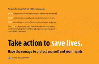
My design for the Alcohol Awareness week poster that will be up in all the Aggie Shuttle Buses!

Brand ID Design

Brand Identity Design is the best class ever. I have sky-rocketed in my skill with Graphic Design. I'll almost make the claim that I'm good. Really good. Here's a quick summary of the projects I've had throughout the semester.
This one's due this Wednesday; for a venture capital company, I'll sell it to ya later.

Boo at the Zoo logo, for a seasonal event, any zoo.
Venture Point, the product of an arduous group process. The group made up the software and company and mission/positioning statement. Each group member made their own logo, this is mine.
Another logo with my initials. Dynamic, figure-ground relationship, pretty much awesome.

The otter. Our first assignment was to abstract an animal. My teacher complimented me very highly by saying it's almost a portfolio piece.

Tuesday, August 3, 2010

Logos (200th Post)

Started submitting to logo contests again, hope I can make a few bucks off 'em. These are probably the best logos I've submitted in my entire career.

This one's my favorite. I'll come back later and copy the awesome descriptions I made about the two--they're full of intrigue and excitement. Actually I think I might be able to sweet talk my logos into better positions, because if I comment on each of my designs, it'll make me sound more professional and the client will see the logo the way I want them to. Plus hardly any of those guys on the contest site put the effort to do such a thing, so it might be the way I can stand out. A couple weeks ago I got back on to find a particularly horrifying contest was up. It was a 25th anniversary logo for a t-shirt in which the client wanted to feature the Capitol Building, some fancy bridge and the Italian flag and had essentially 3 lines of text. (you should already smell the trouble of an exhausting, ugly montage of crappy images). It was a Saturday. I saw the ueber-crappy designs that were posted and there were only 4 hours remaining...So I decided I'd show them all by throwing something together in an hour, slapping on all the kuh-schwein they wanted, and I was gonna prove I could do better than all those people. I ranked third. Embarassingly enough, that's been my highest ranking so far. I'm pretty sure if I had changed the colors a bit, I would've actually won the thing. Still, I'd definitely say I proved my point.

Tuesday, July 13, 2010

Killer Site: Audio Intros

This is pretty much the second full website I've ever designed. I usually just do header/body/footer images that go into a template my dad created. This, however, is a part of a spectacularly fun project, because I made part of the product being sold, I designed the entire layout, I'm working on the code and am even getting hover-states in there, plus, this has been my little experiement/chance to redesign the sales process for Syncnet. If this is a success, I will hopefully start Revamping all of our sales pages, 'cause I'm absolutely sick and disgusted when I look at and read through the standard 2001 sales pages. Look out world, our new sites are killer.

Wednesday, June 23, 2010

Cake Business Cards


My shot at business cards for Frosted on Top.

Friday, June 11, 2010

Missile

Tip of a missile from a fighter plane on the aircraft-carrier-turned-US Maritime Museum at San Diego. Very cool. I did a really good job beefing up this image in Photoshop.

Wednesday, April 28, 2010

Monogram

This is my monogram. I think it was very successful. A monogram is a combination of letters into a unique symbol, essentially, and in this case, we were to use our initials. This was a very fun project to end on, I love these logo-type assignments, because I think that's where my strength is in Graphic Design.

Site Sculpture

The final sculpture project was site-specific and whatever we made it had to be at least 10 feet tall. My teacher wanted our paper airplane hung on the side of the Fine Arts Center, so we nailed large bolts into the wall.

Another angle, kinda gives it an idea of the size.

This is my favorite sculpture so far, the giant Rubik's Cube. Unfortunately I can't claim any credit for it, but I wish I could. I was also saddened when I saw that both my plane and the Rubik's Cube were destroyed in our wonderful windstorm/snowstorm last night.

Sunday, April 18, 2010

Deep

This is THE strongest piece in my portfolio right now, the one I'm most proud of, and it is flippin' tight! Ah! I love the deep, so I was super excited to learn I could deviate from the mainstream of my classmates' subjects; we could chose between making our brochure on the British Natural History Museum or the Victoria and Albert Museum (art), and I took it a step farther and did it specifically on an upcoming exhibit of the NHM: The Deep. I like to stare at my cover.
Inner spread. Much more simplified than my originals. So sweet.

The back-cover. Very nice. My teacher only had a few details of corrections for me in critique just before the BFA review, which was so nice. My cover was also the only one he said really "seduced" him--the ultimate objective that he stressed throughout this project--so that made me super happy. Sigh.

Portfolio stuffs

This is the glory of my infamous shoe-spider. The one I worked on all night long, making go a whole 38 hours and 40-ish minutes without sleep, which was horrible. However, it is done! And it is amazing. I wish I had had time to get better pictures. I love this sculpture!
The whole set-up.

This is the last of the Phi series, the one I redid, since it was positively disgusting before, so I completely changed it and am now almost happy with it, but I had to get it done for the BFA review which was on Friday--that's the super stressful event in which we turn in our portfolios and find out if we're good enough to continue and get into the Graphic Design program. I made it!!! By the way! I'm in Graphic Design! Stress is gone. :)

Thursday, March 25, 2010

Phi


Our last assignment in Typograpy was to choose a Greek letter and write at least 100 words about it, then use that copy, the symbol and display text to create three designs, each emphasizing one of the three elements. This one was by far my strongest piece of the three I created, and I like it alot, even though I had to print it out 4 times to get it to be the right size, so I wasted a good 75 cents or so on it...This one was meant to emphasize the symbol.

I don't really like this one any more, but it's better than my third piece, which I will not post until I redo it. This one was to emphasize the display text (title).

Friday, March 19, 2010

Hell


In typography, we made images for a quote and put 'em together. This is not what I did for the assignment, but the quote was one of my peer's, and I thought I'd try my hand at it. The actual quote is just the first line of text.

Wednesday, March 3, 2010

Another Look At MSE: Implementation

I love this design so much, I just have to show its implementation! This is just the page without content--generally our sites go to a page like this when a user tries to access the site without logging in, hence the buttons and side panel, all encouraging you to sign up. I made the buttons and graphics, Dad chose the colors for the side bar and the navigation buttons, but I really like his choices, so I'm advising him to keep it that way. So sehr schoen!

Sunday, February 28, 2010

How Does It Make You Feel?

After I went up the canyon again last Sunday, I stopped to look over the valley at a parking lot just off campus on 400 North. As I sat, enjoying the visual feast, I started picking up rocks and thought it'd be fun to put 'em together into a sculpture, since this whole year has been very 3-D oriented. I went back and hot glued this little thing. I think it's actually pretty cool, and I did do a great job editing the photo, since you can no longer see the hot glue.

Friday, February 26, 2010

MSE Identity

Brand new logo for a brand new site. I think this is one of my more successful logos.

Proposed website-design, without title/tagline text on header and the links/copyright on footer.

Monday, February 8, 2010

It's My Head!

Self-Portrait. In clay. I'm making an angry face (in case you were uncertain).
Can't show you a straight-on shot, 'cause it looks really bad on camera--even worse than in person!
We'll pretend my bangs are that short...
This is my good side ;D I really like this angle


Sunday, February 7, 2010

Typogram

This assignment in Typography was so cool! A Typogram is much like a logo (though it can be a logo) in that it communicates the meaning of the word, using only the anatomy of the given letterform. I absolutely love this, and am so proud of myself for coming up with something this strong! :D

Wednesday, January 20, 2010

Sneak Peek

Cool little thing I cooked up during the break for the Audio Intros.

Wednesday, January 13, 2010

The Pitch

New ideas for the ezicing logo...

Wednesday, January 6, 2010

There We Go

Pretty proud of this here image, I gotta say. It's for a product we're launching as a part of another product: Royalty-Free Audio Intros, some of which I created, perfect for presentations, websites, movies, etc. ;)