Did these on the 22nd. Here's the logo for Biz500 I made for work--same story as my last post, but different site.
 Site header
 Section header
 Did these on the 22nd. Here's the logo for Biz500 I made for work--same story as my last post, but different site. Site header Section header
 Hooray for the DOA, the new site I'm working on. This time I got to choose the colors and create a brand-(pun intended) new logo. I came up with all of this today--I tried playin' with logo ideas yesterday, but none of them worked out. Here's my splash page (above) with varying sizes of the logo.
 This is the header that will go at the top of the website (I'm not sure what the subtext will be, but I'm pretty sure I'll have to some in)
 #7. Funny thing about this one, I did this one and I did another one (see number 13. [coming soon]) and once you see it, you'll understand. It was purely accident, so I quickly got rid of one of 'em to a girl that was gone on trading day so that no one else would realize what I had done. To fully understand, just remember to look for #13 when I post it in the future.
 #8. I don't remember anything significant about this one.
 #9. This one was modelled after a bunch of the ones on youtube with the whole grid thing. The city didn't turn out so great, but I did realize that I had a whole complimentary-color scheme goin' on, so that pleased me.
 #10. All I can say is that I hate it.
 Ahh! What is that hideous thing? Why, that's my blind-contour self-portrait I had to do for Drawing I. I do hope this actually gets my hand-eye coordination better, rather than just make me feel stupid.
 Here's an older sketch book page from about two weeks ago. I drew this stuff on my way down to Sandy for the Labor Day Weekend. I was trying to figure out the whole web 2.0 designs that day and also just trying to come with ideas for quick logos. I did the self-portrait (basically my first ever) looking in the side-view mirror, because I rode in shotgun. Even though the dark shadow conceals a lot of my face/important features like my eyes, I think it has a stunning resemblance. I'm amazing.
 These are for Syncnet's LCDEV website as part of the eBizsuite, because we're membership website experts. I think they are much better/more professional, which of course, they have to be, plus I might just be biased to the fact that there's no pink in these ones. I know there is an extra green on the last row, as I compiled them I realized I'd left out the forum button, but when I loaded it up and it was green, I realized that there's something amiss, and I'll probably get a call to redo yet another button...
 This is what I did in the summer time for the cake decorating ideas website, pretty cool, I think.

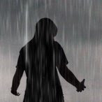
 Tired of watching dumb cartoons...TMNT is the only good one on anymore. this is a scene I came up with last night at the bonfire thing I had last night up at 2nd dam. I saw it walking back to the cars and I knew I had to paint it sometime, so here's a quick, rough, value study I did in Photoshop.
 Needed somethin' else to draw after the value study, so I went out of my norm and tried my hand at a cartoon person. A fat cartoon person. I think he's a business guy, but I don't know. I probably won't take the time to finish his face, so that's why I'm posting him at this stage.
 I finally realized how weird the logo looked with sharp edges, so I put the darn thing in Photoshop, wonderful Photoshop, and erased the edges and fine-tuned the whole web 2.0 shiny thing. I think the small changes actually made it a stronger logo. Strange how that works.
 This is the logo in action with the two possible sides it can go on with the syncnet text.